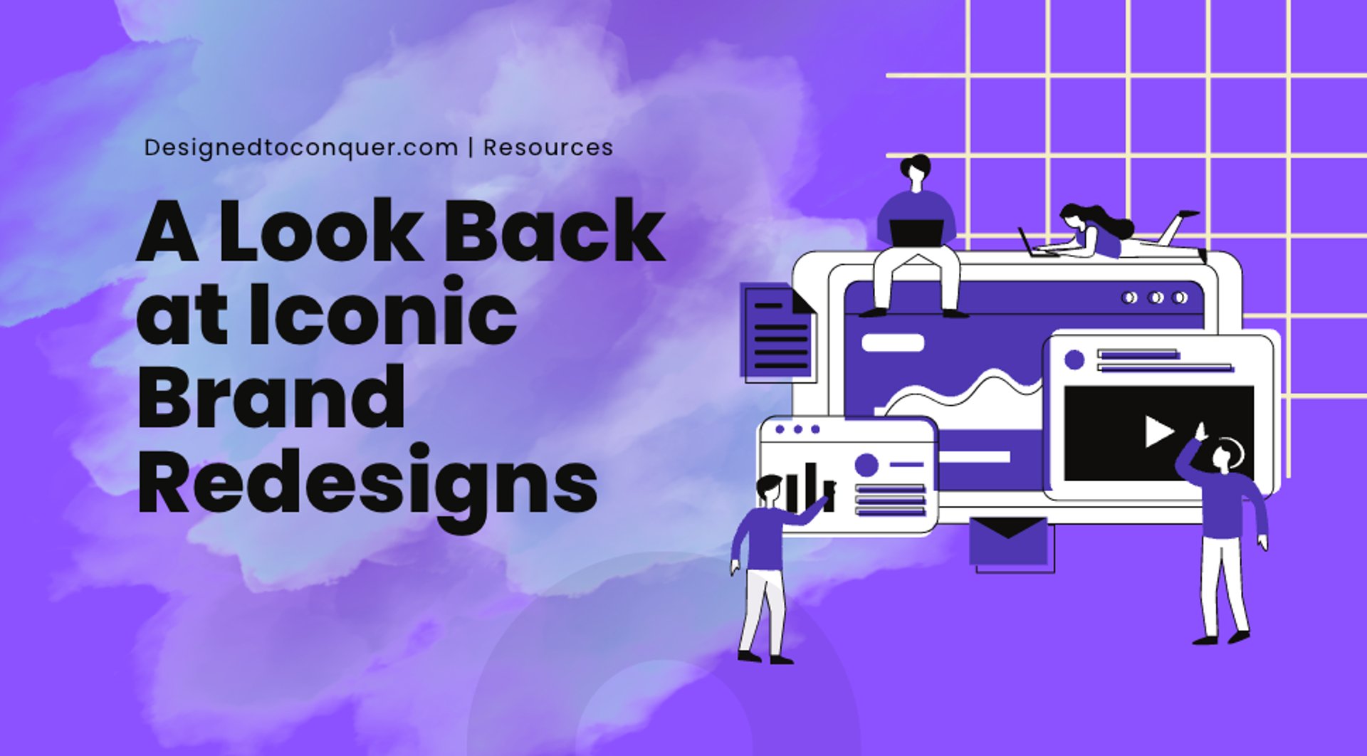
A Look Back at Iconic Brand Redesigns
Learn how iconic brands transformed their logos, the redesign reasons and the brand identities impact.
10/12/20233 min read

The Evolution of Logos
In the ever-changing world of branding and design, logos play a pivotal role in shaping a company's identity. They are the visual representation of a brand's values, personality, and message. Over time, many iconic brands have recognized the need to evolve and adapt their logos to stay relevant in an ever-shifting market.
In this blog post, we take a fascinating journey through the history of iconic logo redesigns, exploring the reasons behind these transformations and the impact they had on the brands they represent.
The Power of a Logo
Before we dive into the world of logo redesigns, let's first understand why logos are so important. A logo is often the first point of contact between a brand and its audience. It serves as a quick and memorable way for consumers to recognize and connect with a company. When done right, a logo can convey a brand's story, values, and promise in a single glance.
Pepsi
One of the most well-known logo redesigns is that of Pepsi. Over the years, Pepsi has undergone several logo changes, each reflecting the cultural and design trends of its time. The evolution from the original script font to the modern circular icon, known as the Pepsi Globe, mirrors the shift towards simplicity and global appeal.
In 2008, Pepsi took a bold step by completely revamping its logo, removing the text and leaving only the red, white, and blue circular icon. This move was aimed at making the brand more contemporary and global, as well as emphasizing the brand's focus on the drink itself, rather than just the company name. The redesign was met with mixed reviews but undoubtedly made a statement.
Apple
Apple is synonymous with innovation, and its logo has played a significant role in conveying that message. The original logo depicted Sir Isaac Newton sitting beneath an apple tree. However, it was the rainbow-colored apple with a bite taken out of it that became iconic.
In 1998, Apple opted for a sleeker and monochromatic design, moving away from the colorful logo of the past. This change was significant in showcasing Apple's shift from a niche computer company to a global technology giant. The bitten apple remains, a symbol of knowledge and discovery.
Starbucks
Starbucks, known for its coffee and unique brand experience, has undergone a logo evolution that aligns with its journey from a local coffeehouse to a global coffee chain. The original Starbucks logo featured a more intricate design with a siren in the center. Over the years, the company gradually simplified its logo, focusing on the siren's face.
In 2011, Starbucks unveiled a significant redesign, removing the text entirely and leaving only the iconic siren. This decision symbolized the brand's confidence in its recognition and allowed Starbucks to expand its product offerings beyond coffee. The siren's green color remained consistent, signifying growth and nature.
The Impact of Logo Redesigns
So, why do brands invest in logo redesigns? The reasons can vary but often include staying relevant in a changing market, appealing to a broader audience, and adapting to new design trends. A successful logo redesign can have several positive outcomes for a brand:
Modernization: A redesigned logo can give a brand a fresh and modern look, signaling that the company is moving forward and adapting to current trends.
Simplicity: Many redesigns simplify logos, making them cleaner and easier to reproduce in various media. This can improve brand recognition and flexibility.
Globalization: As brands expand globally, they may opt for logos with universal appeal, removing language-specific elements.
Digital Adaptation: In the digital age, logos need to be versatile and look good on screens of all sizes. Redesigns often consider digital applications.
Rebranding: Logo changes can signify a broader rebranding effort, which includes changes in messaging, values, and brand positioning.
Long Story Short
The evolution of logos reflects not only changes in design trends but also the evolving identities of the brands they represent. It's a testament to the dynamic nature of business and the importance of staying relevant in a constantly shifting market. Iconic brands like Pepsi, Apple, and Starbucks have used logo redesigns to their advantage, sending powerful messages about growth, adaptation, and innovation.
As you consider the role of design and branding in your own business, remember that a logo is not a static entity. It can evolve and adapt alongside your company's journey, reflecting your growth, values, and commitment to staying connected with your audience. Whether you're considering a logo redesign or starting from scratch, take inspiration from these iconic brands and the impact their logos have had on the world.
Related Articles
©2026 Designed To Conquer LLC Terms & Conditions FAQ Private Policy
Designed To Conquer LLC is a NYS MBE Certified Creative Tech. Studio.
STUDIO HOURS
Monday: 10am-6pm
Tuesday:10am-6pm
Wednesday:10am-6pm
Thursday:10am-6pm
Friday:10am-6pm
Get the 5-step checklist we use for every client launch.