Make your website mobile-friendly
Having a mobile-friendly website has become a very critical part of having a successful online presence.
6/3/20253 min read
Why make a website mobile-friendly?
Making a website mobile-friendly means making it functional on a smartphone. In many countries, the number of smartphones has surpassed the number of personal computers. In the United States, 95% of people with smartphones search for local information on their phones.
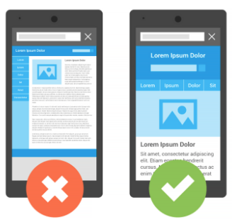
Make a website mobile-friendly
If a website is not mobile-friendly, it can be difficult to view and use on a mobile device. A non-mobile-friendly site requires users to pinch or zoom to read the content. Users find this frustrating. When frustrated, users may abandon the website.
When a website is mobile-friendly, it is readable and immediately usable on a smartphone. This ensures that visitors have a good experience on a site when they’re visiting from their mobile devices.
The work to make a website mobile-friendly depends on a company’s resources, business model, and expertise. Many website themes and builders take content and automatically make it mobile-friendly. Always check the mobile version of your site to ensure the content reads well and is easy to navigate.

What to know when building a mobile-friendly website
Consider your customers’ objectives. Do they want to be entertained by your blog post? Do they need your restaurant’s address? Do they want to read your product’s reviews? Design your website so it’s easy for them to achieve their objectives.
To do this, outline the steps in your customers’ journey. Make sure they can easily take these steps and achieve the journey on a mobile device.
Measure the effectiveness of your website by how easy mobile customers can complete common tasks.
Make a list of common tasks customers make on your website. Then, have several people test doing those tasks. How easy were they to complete? Focus on consistency in your interface and produce a unified experience across all platforms.
Use a responsive web design.
A responsive web design means that the website uses the same code whether the user is on a desktop computer, tablet, or mobile phone. The display adjusts according to the screen size.
Google recommends using a responsive web design over other design patterns. One benefit of using a responsive web design is that you only need to maintain one version of your site instead of two—one for mobile and one for desktop.
Make it easy for customers to use.
Top three mistakes beginners should avoid
Remember that good mobile sites are useful–they help visitors complete their tasks. Don’t focus solely on creating a mobile-formatted site and forget about providing full functionality. A mobile-formatted site may appear fine on a smartphone, however, if it isn’t as functional as a website on a computer, it may hinder the user. Additionally, ensure that mobile formatting and functionality is inclusive for those who don’t have access to a computer and do most of their tasks on a smartphone.
Implementing the mobile site on a different domain
Creating separate mobile URLs significantly increases the amount of work required to maintain and update your site. It also introduces possible sources of technical problems.
You can simplify your website management by using a responsive web design. This design will serve a desktop and mobile website on the same URL.
Working in isolation rather than searching for inspiration
Before you begin making your website mobile-friendly, review other sites in your industry, such as competitors for inspiration and best practices. Learn from features you find useful and not useful on their websites.
Forgetting their mobile customer
Long Story Short
Having a mobile-friendly website is essential. An easy to use website on a smartphone helps customers achieve their objectives. When building a new website, consider using a responsive web design. This design is much easier to manage than having a separate website for desktop computers and smartphones.
If you don’t know if your website is mobile-friendly, use Google’s Mobile-Friendly Test. The test will determine if there are any issues affecting visitors.
Related Articles
©2026 Designed To Conquer LLC Terms & Conditions FAQ Private Policy
Designed To Conquer LLC is a NYS MBE Certified Creative Tech. Studio.
STUDIO HOURS
Monday: 10am-6pm
Tuesday:10am-6pm
Wednesday:10am-6pm
Thursday:10am-6pm
Friday:10am-6pm
Get the 5-step checklist we use for every client launch.